

Creating animated data visualisations in Python is a great way to communicate complex information in a dynamic and engaging way. By using libraries such as Matplotlib and Seaborn, you can create beautiful, interactive charts and plots that bring your data to life. By adding animation to your visualisations, you can highlight important trends and patterns and capture the attention of your audience. In this tutorial, we will walk through the steps of building an animated data visualisation in Python, from preparing your data to adding the final touches to your animations.
This tutorial will begin with just the km/h speeds of athletes across a few sports. We’ll use these to create a dataset of the athletes’ hypothetical progress along a 100m race at their top speed. With this data, we will then plot each athlete’s progress at an arbitrary time in the race. Our animation is then simply creating this plot at each point in time, then stitching them together.
Importing libraries
First things first, we need to import our libraries. We’ll be using the following:
- Pandas & Numpy for data manipulation and storage.
- Matplotlib for visualisation and animation.
import pandas as pd
import numpy as np

from matplotlib import pyplot as plt
from matplotlib.animation import FuncAnimation
Creating our dataset
We are going to start by defining a list of athletes heralded as the fastest in their respective sports (yes, even Darwin, thank you Goal.com 🙇♂️) and another list with their speeds in km/h.
players = ['McDavid', 'Bolt', 'Darwin', 'Taylor', 'FC Python']
speeds = [40.9, 37.6, 36.5, 35.6, 17.1]
Next, the list ‘speeds’ is converted from kilometres per hour to metres per second. This is done using a list comprehension that multiplies each speed by 1000 and divides it by 3600. This makes it easier to calculate speed over time over shorter distances.
speeds = [(i*1000)/3600 for i in speeds]Now, we need to create a dataframe that we will plot against. To start, an empty DataFrame data is created. A loop is then started that iterates over the list of speeds with ‘enumerate’. “enumerate()” is a built-in function of Python that allows you to loop over a list and retrieve both the index and the value of each element in the list. Having the index means that we can also access the appropriate player from the names list.
For each speed, we calculate the distance traveled by the player over time in increments of 0.1 seconds. This is done with numpy’s arange function that returns an array with evenly spaced values within a given range. In this case, we go from from a range of 0 – 100 at a space of the player’s m/s, and divide it by 10 to get smaller spacing in our data for a smoother visualisation (effectively m/ms).
This array is then added as a new column in the DataFrame, using the player name from the ‘players’ list as the column title. This column contains a list of the distance traveled by the player over time in increments of 0.1 seconds.
data = pd.DataFrame()

for idx, each in enumerate(speeds):
    newCol = np.arange(0, 100, each/10)
    tempdata = pd.DataFrame({players[idx]: newCol})
    data = pd.concat([data, tempdata], ignore_index=False, axis=1)
As players will finish at different times, the columns are uneven lengths, with empty cells making up the gaps. We fill these with 100 to create a full dataframe with the .fillna() function on our dataframe.
data = data.fillna(100)We now have our data to plot. Let’s check it out with data.head()
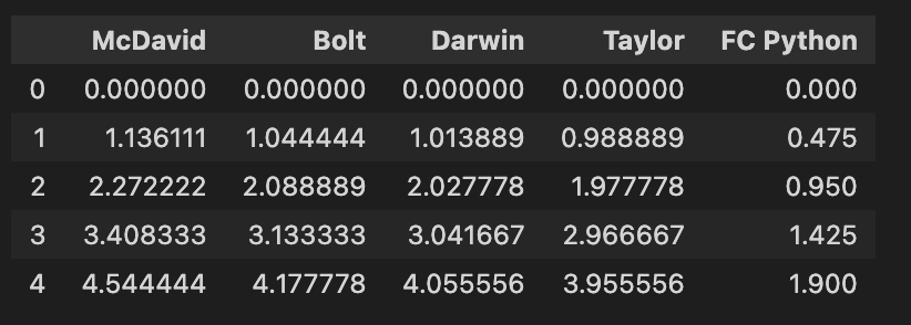
Checks out! We’ll now plot any given frame before looking at creating an animation with every frame stitched together.
Checks out! We’ll now plot any given frame before looking at creating an animation with every frame stitched together.
Creating a simple bar plot
Bar plots are covered more extensively here, so we won’t go into much depth. But at its simplest, matplotlib will create a bar plot for you with a list of names and a list of values. Here, we pass the names of our players, and the row of values at line 55 of our dataframe:
plt.barh(players, data.iloc[55])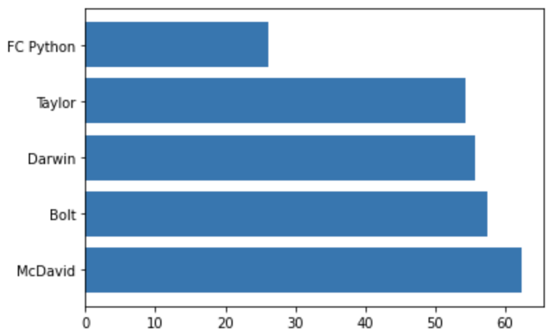
Yes, McDavid is on ice skates.
Our plot then shows these values, with the athlete names as their labels. This is pretty boring though, and there are so many improvements that we can make. Let’s throw a load in below, with explanations for what we are doing in the comments.
#Create a blank plot to put some styling onto
fig, ax = plt.subplots()

#Run the x axis from 0-100
plt.xlim(0, 100)

#Invert the y axis so that the fastest players are at the top
plt.gca().invert_yaxis()

#Change the font to Helvetica
plt.rcParams["font.family"] = "helvetica"

#Add chart and axis labels
ax.set_xlabel('Metres') ax.set_ylabel('Athlete') ax.set_title("Comparing your sports' best athletes over 100m")

#Remove the plot borders on three sides
ax.spines['right'].set_visible(False) ax.spines['top'].set_visible(False) ax.spines['bottom'].set_visible(False)

#Plot again, but with the players' team colours
plt.barh(players, data.iloc[55], color=['#FF4C00', '#007749', '#C8102E', '#002C5F', '#910BF3'])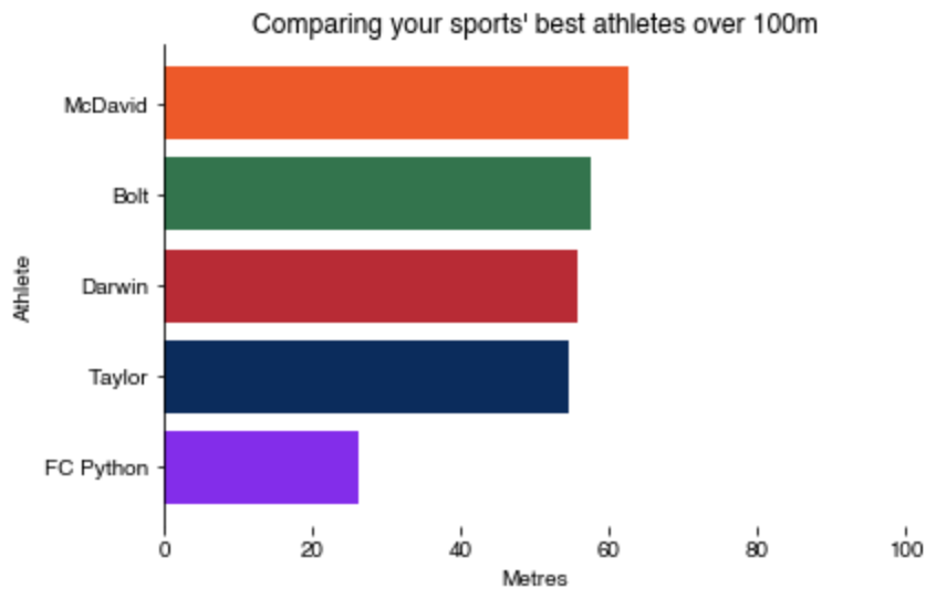
Animating visualisations
The logic for viz animation is simple and one you get your head around it, you’ll wonder why you ever thought it would be so intimidating!
We need to build our first frame, just as we did before, then call a function that iterates through our dataset, essentially plotting on top of it. Let’s check out the code to do this:
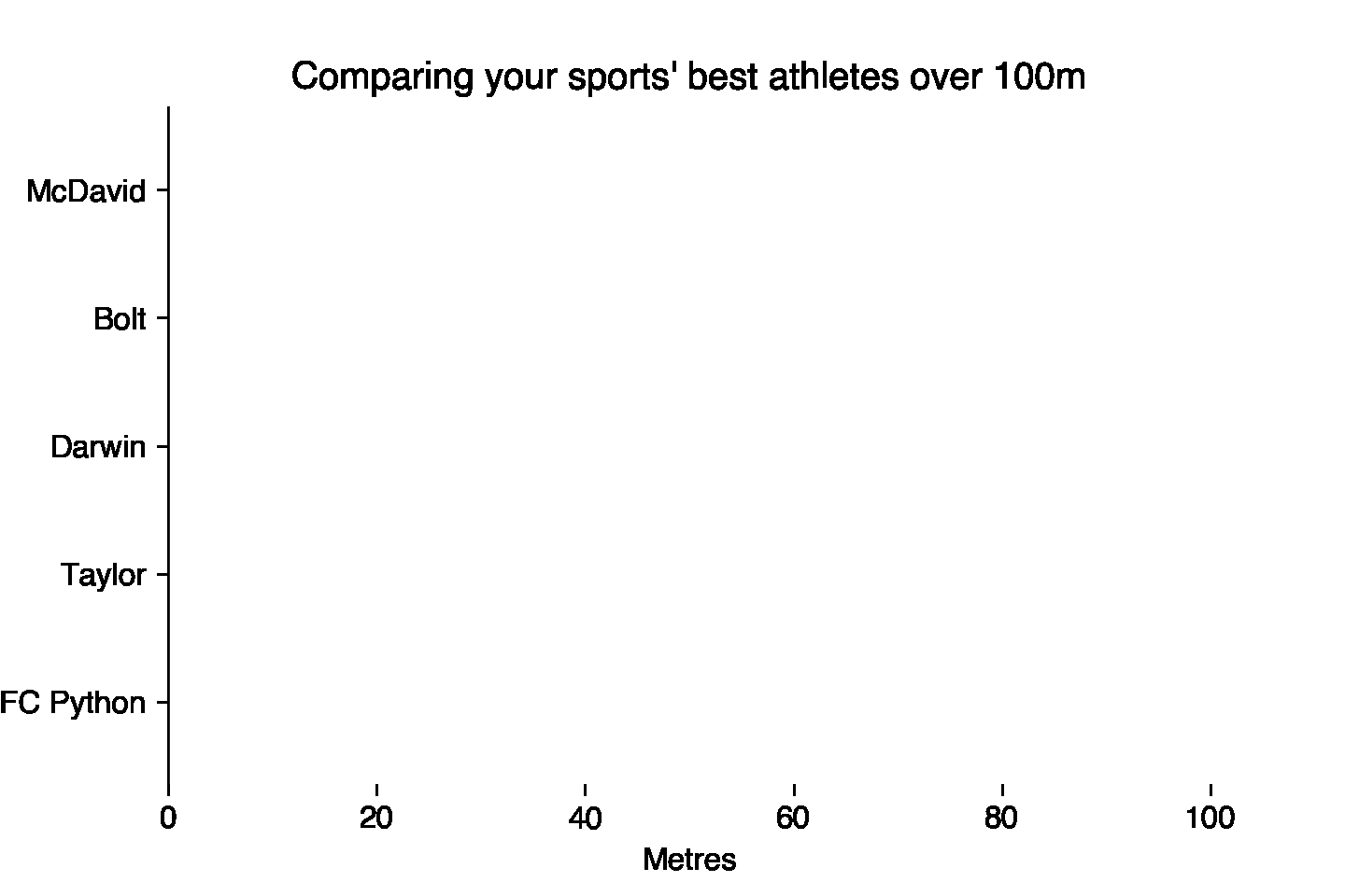
def init():
    plt.barh(players, data.iloc[0])


def animate(i):
    plt.barh(players, data.iloc[i], color=['#FF4C00', '#007749', '#C8102E', '#002C5F', '#910BF3'])


anim = FuncAnimation(fig, animate, init_func=init, repeat=True, save_count=len(data))
The init() function initializes the animation by plotting a bar chart with the data in the first row of the DataFrame data. The animate() function updates the bar chart for each frame of the animation by replotting the chart with the data in the next row of the DataFrame.
The FuncAnimation() function from Matplotlib’s animation module is used to create the animation. It takes the following arguments:
fig: The Figure object that the animation will be drawn on.animate: The function that updates the plot for each frame of the animation.init_func: The function that initializes the plot.repeat: Controls whether the animation should repeat when it reaches the end. If set toTrue, the animation will loop indefinitely.save_count: The number of frames in the animation.
The animation will show a bar chart for each row in the DataFrame, with the bars colored according to the list of colors provided. The animation will repeat indefinitely, creating the illusion of a smoothly changing chart over time.
If we add the code from our prettier chart below to this, we get the following:
fig, ax = plt.subplots()
plt.xlim(0, 100)
plt.gca().invert_yaxis()
plt.rcParams["font.family"] = "helvetica"

ax.set_xlabel('Metres')
ax.set_ylabel('Athlete')
ax.set_title("Comparing your sports' best athletes over 100m")
ax.spines['right'].set_visible(False)
ax.spines['top'].set_visible(False)
ax.spines['bottom'].set_visible(False)

def init():
    plt.barh(players, data.iloc[0])


def animate(i):
    plt.barh(players, data.iloc[i], color=['#FF4C00', '#007749', '#C8102E', '#002C5F', '#910BF3'])


anim = FuncAnimation(fig, animate, init_func=init, repeat=True, save_count=len(data))
anim.save('100mPretty.gif', writer='imagemagick', fps=10, dpi=240)
Pretty cool! Great job for making it far enough to make your own animated visualisation. We created a dataset and plotted a single row of it with a simple bar chart. We then smartened this up a bit before plotting each row in an animated visualisation – in a simple process of plotting the opening frame, then used an animation function to iterate through each row as a frame.
Where can you take this skill from here? Plot players and the ball on a pitch? Add fading-in/out annotations to tell your story to your audience? Moving plot of your team’s points as they win the league? We can’t wait to see what you do – let us know on Twitter.