

Cumulative line charts feature in loads of great and popular visualisations across the football analytics community. Most commonly, they are seen in xG or shot counts throughout a game. In the example from Ben Mayhew below, we can see how a great visualisation gives us so much more detail than a total xG figure would. It gives us periods of dominance from a team and the spread for both teams over a game:
Timeline graphics for yesterday’s EFL matches are now on the site in the usual place: https://t.co/rCUTGrcH1i pic.twitter.com/m9AujgoRlI
— Ben Mayhew (@experimental361) January 6, 2019
Further examples from Statsbomb again looking at cumulative xG and from FT’s John Burn-Murdoch comparing prolific batsmen.
This tutorial will take us through creating a cumulative line chart for points throughout a season. We’re going to take the following steps to get to our visualisation:
1) Import our data
2) Transform it into a usable format
3) Put our data into a basic visualisation
4) Style our visualisation
Let’s get our libraries into place and get started.
# libraries
import matplotlib.pyplot as plt
import numpy as np
import pandas as pd

%matplotlib inline
1) Import our data
Data for this tutorial comes from http://football-data.co.uk/ – a great resource for match-by-match results data from a number of global leagues. Feel free to use any of the leagues provided to follow along with.
Download a csv of a season’s worth of matches (or part of an ongoing season) and put it in the file with your script.
After that, import your data with pandas and assign it to a dataframe:
#Import our data and assign it to 'data'
data = pd.read_csv("1718EPL.csv")

#Show the top of the dataframe
data.head()
2) Transform our data into a usable format
Our data is a match-by-match look at a season and this won’t help us much for a line chart. We need our data to be the data that we want to plot – a list of the cumulative totals for each team over the season.
Ideally, we will do this for every team altogether, rather than one team at a time. So let’s firstly create a list of the unique teams in our dataframe.
We’ll then create a dictionary that will iterate over our teams and give each a list that starts with a 0, as each team obviously starts with 0 points.
#Create a list of unique teams from the home team column
Teams = data.HomeTeam.unique()

#Create a dictionary called TeamLists. There will be an entry for each team with the list [0]
TeamLists = {Team : [0] for Team in Teams}
With a starter list ready for each team, we just need to run through each match, find out who won and add a new entry into the correct team’s list with their points.
Let’s do this by working through each line of our dataframe, learning who the home team and away team are, then running an if statement to learn the result. Once we know the result, we can add each team’s points with the append method:
#For each row in our dataframe, I want to do the following:
for row in data.itertuples():
    #Add the home and away team names to the correct variable
    Home = row.HomeTeam
    Away = row.AwayTeam

    #If the home team goals (FTHG column in the dataframe) are higher than the away team, give the correct points to each team
    if row.FTHG > row.FTAG:
        TeamLists[Home].append(3)
        TeamLists[Away].append(0)
    #If the home team goals are less than the away team, give the correct points
    elif row.FTHG < row.FTAG:
        TeamLists[Home].append(0)
        TeamLists[Away].append(3)
    #In any other case (a draw), give the correct points
    else:
        TeamLists[Home].append(1)
        TeamLists[Away].append(1)
We have stored the lists inside the TeamLists dictionary, so let’s check out the Arsenal entry in there.
TeamLists["Arsenal"]
Ah, we have just appended the points, but done nothing to run these as cumulative totals throughout the season.
To achieve this, we somehow need to access the previous game and just add our result to this. Our lists tutorial goes through accessing certain values, but we can navigate backwards through a list with a negative value in square brackets, e.g. myList[-1].
So let’s reset our Teams and TeamLists variable so that they do not contain our previous data. With that all cleaned up, we can repeat our for loop above, but instead of appending the points – we will append the sum of points and the previous value.
Teams = data.HomeTeam.unique()
TeamLists = {Team : [0] for Team in Teams}

for row in data.itertuples():
    Home = row.HomeTeam
    Away = row.AwayTeam

    if row.FTHG > row.FTAG:
        TeamLists[Home].append(TeamLists[Home][-1]+3)
        TeamLists[Away].append(TeamLists[Away][-1]+0)
    elif row.FTHG < row.FTAG:
        TeamLists[Home].append(TeamLists[Home][-1]+0)
        TeamLists[Away].append(TeamLists[Away][-1]+3)
    else:
        TeamLists[Home].append(TeamLists[Home][-1]+1)
        TeamLists[Away].append(TeamLists[Away][-1]+1)
Let’s check out Arsenal again – hopefully this makes more sense as a running total.
TeamLists["Arsenal"]
Perfect! Let’s get onto putting this into an easy visualisation:
3) Put our data into a basic viz
Matplotlib makes it ridiculously simple to create a line chart. The .plot function ideally takes at least 2 arguments, the x and y location of each point on the line. The points provide one of the coordinates of each point, we just need to create a list containing numbers 0-38 for our matchdays (0 is the starting point).
We can do this by using the range function within the list function. For this, range needs two numbers, the starting number and the end number + 1:
Matchday = list(range(0,39))
Now let’s take advantage of matplotlib’s beautifully easy plotting, by using .plot along with our matchday and team lists:
#Create a line plot with matchday and teamlist figures for two teams
plt.plot(Matchday, TeamLists["Southampton"])
plt.plot(Matchday, TeamLists["Swansea"])
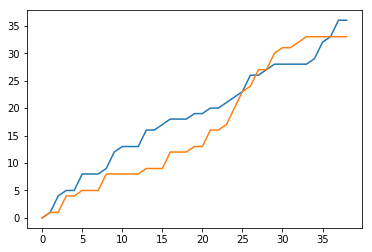
Plenty that needs to be done to improve this, but a really solid start!
4) Styling the visualisation
Just like any default visualisation, the style will have been seen a million times. Whether you’re following along here, or creating visualisations in Excel or elsewhere, it is a great idea to get a clean style that identifies as your own.
For this visualisation, we’re just going to set a few titles and change colours/weights of our lines. You can find a few more visualisation tricks and tips here (https://fcpython.com/blog/making-better-visualisations).
#Create the bare bones of what will be our visualisation
fig, ax = plt.subplots()

#Add our data as before, but setting colours and widths of lines
plt.plot(Matchday, TeamLists["Man City"], color = "#6CABDD", linewidth=2)
plt.plot(Matchday, TeamLists["Swansea"], color = "#231F20", linewidth=2)

#Give the axes and plot a title each
plt.xlabel('Gameweek')
plt.ylabel('Points')
plt.title('Man City v Swansea Running Points')

#Add a faint grey grid
plt.grid()
ax.xaxis.grid(color = "#F8F8F8")
ax.yaxis.grid(color = "#F9F9F9")

#Remove the margins between our lines and the axes
plt.margins(x=0,y=0)

#Remove the spines of the chart on the top and right sides
ax.spines['right'].set_visible(False)
ax.spines['top'].set_visible(False)
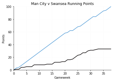
And there we go, a clean look at two teams’ running points over the season. Still loads that we could change to improve it, such as new fonts, add all other teams in greyed out lines or add some data labels. Give it a go and take a look through the documentation/Google when you get stuck!
In this tutorial, we have seen how to take a match-by-match dataset and transform it into a format that allows for a line chart with the running total. You can apply the same logic to any metric throughout a match, a different variable through a season or even a single player’s running goals total throughout a career.
Find our other visualisation tutorials here, and show us what you come up with @FC_Python!