

Animations can help you to add something special to a visualisation – whether you want to add extra data, cycle annotations or draw attention to something, a subtle and smart animation might be what you are looking for.
Fortunately for us, Python also makes it much easier to do this than you might think. We just need to break our thinking around the process down into three parts:
- Picture your animation as a series of different images
- Create and save these images individually
- Stitch them together
In this example, we are going to chart birth months by year for a series of leagues to see how this is distributed. In an ideal world, we would expect this to be equal. Any imbalance between the months would suggest that there are biases somewhere in the development process!
The data used is a subset of the FIFA 21 dataset found here. We are going to import a csv, extract a few select leagues and build our plots from there.
Import modules, data and get ready for plotting
Let’s get our modules in place and load up our data.
import os

import pandas as pd

import numpy as np

import calendar


import matplotlib.pyplot as plt


import imageio


import random


df = pd.read_csv('players_21.csv')
You can check this out with the df.head() command, but the dataset is a player per row, with all of their FIFA data. This includes performance attributes and biographical data. For the purposes of this article, we are just interested in their date of birth (‘dob’ column), which is formatted in YYYY-MM-DD, and their league.
Firstly, let’s cut our data down to just the leagues we want to analyse.
leagues = ['English Premier League', 'Spain Primera Division', 'Italian Serie A' ,'German 1. Bundesliga', 'French Ligue 1']

df = df[df['league_name'].isin(leagues)]
And now let’s tidy up the ‘dob’ column into a friendly date time format and set up new columns with the parts of the date – month, year, day of week, etc.
df['dob']= pd.to_datetime(df['dob'])

df['year'] = pd.DatetimeIndex(df['dob']).year

df['month'] = pd.DatetimeIndex(df['dob']).month

df['month_name'] = df['month'].apply(lambda x: calendar.month_abbr[x])

df['day'] = pd.DatetimeIndex(df['dob']).day

df['dayofweek'] = pd.DatetimeIndex(df['dob']).weekday
We are now good to go for some plotting
Initial plot
Let’s plot from the top down – what is the distribution of birth months?
(df['month'].value_counts(normalize=True)*100).sort_index().plot()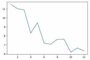
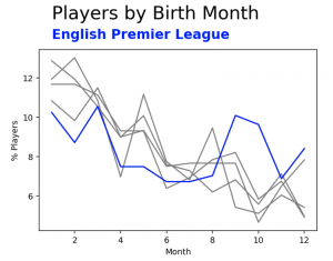
So what do we have here? The X axis shows month of year, January to December at 1 to 12. The Y axis shows the % of players in the dataset born in that month. Already we can see a huge imbalance!
Let’s check out just one league. Take Serie A…
(df[df['league_name']=='Italian Serie A']['month'].value_counts(normalize=True)*100).sort_index().plot()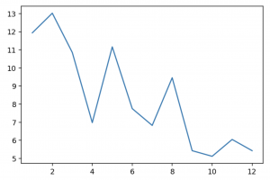
So we can see it here too by plotting with a subset of the data. It would be cool if we could plot all of the individual leagues with a few lines to get some comparison! Let’s use a for loop to plot each of the countries, then plot Series A on top of it. Notice that we set a colour to grey out all of the leagues at first.
for league in leagues:

    (df[df['league_name']==league]['month'].value_counts(normalize=True)*100).sort_index().plot(color = 'gray')


    (df[df['league_name']=='Italian Serie A']['month'].value_counts(normalize=True)*100).sort_index().plot()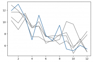
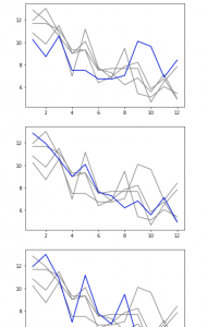
This is great for one league, but we can go one better by wrapping this in another for loop to plot each team as a colour.
for league in leagues:


    fig, ax = plt.subplots(nrows=1, ncols=1)


    for league2 in leagues:

        (df[df['league_name']==league2]['month'].value_counts(normalize=True)*100).sort_index().plot(color = 'gray')


        (df[df['league_name']==league]['month'].value_counts(normalize=True)*100).sort_index().plot(color = 'blue')
(Your charts should all be there!)
Creating our set of plots
This gives us the same chart as above five times over, each with a different league highlighted. We do not have any way of telling which is which, however. Let’s put another couple of lines in the loop to add a title and note for which league is which.
for league in leagues:


    fig, ax = plt.subplots(nrows=1, ncols=1)


    for league2 in leagues:

        (df[df['league_name']==league2]['month'].value_counts(normalize=True)*100).sort_index().plot(color = 'gray')


        (df[df['league_name']==league]['month'].value_counts(normalize=True)*100).sort_index().plot(color = 'blue')


    plt.text(1,15,'Players by Birth Month', fontsize=22, fontweight=300)

    plt.text(1,14,league, fontsize=16, color='blue', fontweight=600)

    plt.xlabel('Month')

    plt.ylabel('% Players')
Progress! We now have this plot five times, with the league name and highlighting changing each time. Everything in blue is a bit bland though. We could give each league a defined colour, but instead let’s create a function that gives us a random colour and use this for each league.
Our random colour function is below. It returns a hex value, like #7b32a8 or #14a664 . A hex value is three values stitched together, each showing how much red, green or blue is in the colour. The value ranges from 00 (none of the colour), to FF (all of the colour). So pure red would be #FF0000 – with all of red and none of blue or green.
In numbers that we use, you can think of 00 as 0, and FF as 255. They get converted into these hexadecimal numbers to keep them to 6 character codes.
So our function takes three random numbers between 0 and 255, converts them to the format above and stitches them together.
def return_random_hex():

    r = lambda: random.randint(0,255)

    return('#%02X%02X%02X' % (r(),r(),r()))
Now let’s use this to create a new colour in each loop and plot our five charts again.
for league in leagues:
fig, ax = plt.subplots(nrows=1, ncols=1)
col = return_random_hex()
for league2 in leagues:
(df[df['league_name']==league2]['month'].value_counts(normalize=True)*100).sort_index().plot(color = 'gray')
(df[df['league_name']==league]['month'].value_counts(normalize=True)*100).sort_index().plot(color = col)
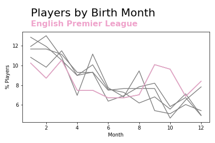
plt.text(1,15,'Players by Birth Month', fontsize=22, fontweight=300)
plt.text(1,14,league, fontsize=16, color=col, fontweight=600)
plt.tight_layout()
plt.xlabel('Month')
plt.ylabel('% Players')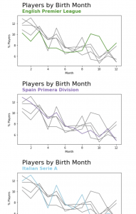
Of course, you will likely get different colours here!
We have our charts, we just need to save them as separate images. To do so, we are going to make just 2 small changes.
Firstly, we will change our for loop to enumerate – which we use when we want access to the number of the current for loop. All that this means is that we give it two parameters for us to reference – the index (first, second, third, etc. iteration of the loop) and the item of the for loop that we are currently working with.
Secondly, we want to save the figure, so we have the plt.savefig() function to achieve this. We have to give the saved file a name, which is where enumerate’s index comes in really handy. As you can see in our final plotting commands below.
for index,league in enumerate(leagues):

    fig, ax = plt.subplots(nrows=1, ncols=1)
    col = return_random_hex()


    for league2 in leagues:
        (df[df['league_name']==league2]['month'].value_counts(normalize=True)*100).sort_index().plot(color = 'gray')


    (df[df['league_name']==league]['month'].value_counts(normalize=True)*100).sort_index().plot(color = col)


    plt.text(1,15,'Players by Birth Month', fontsize=22, fontweight=300)

    plt.text(1,14,league, fontsize=16, color=col, fontweight=600)


    plt.xlabel('Month')

    plt.ylabel('% Players')


    plt.tight_layout()


    plt.savefig(str(index) + '.png')
In the same folder as your python code, you should now have 5 images from 0.png to 4.png.
Creating our gif
Our job now is to stitch these together into a gif. Python makes this so much easier than it should be, with just 4 lines of code 😱
with imageio.get_writer('mygif.gif', mode='I') as writer:

    for index in range(0,4):

        image = imageio.imread(str(index) + '.png')

        writer.append_data(image)
This works by stitching one image after the other. But it is ridiculously fast! To slow it down, we can simply stitch the same image to itself a few times over, to give the appearance of the same image sticking around for a while longer.
We can just wrap our stitching lines in a for loop to repeat this each time:
with imageio.get_writer('mybettergif.gif', mode='I') as writer:

    for index in range(0,4):

        for i in range(0,6):

            image = imageio.imread(str(index) + '.png')

            writer.append_data(image)
That is a bit easier to read and brings us to our goal of creating a nice animated graphics – well done!
Plenty to build on from here. You can make these charts so much nicer to look at, you could look at countries instead of leagues, see if the effects seen here change over time and more.
Elsewhere, you can use animations to bring a bit of life to visualisations. Transitions, labels, colours can all be brought in to put the attention where you want it. Use loops to make gradual changes to visualisations and stitch them together using this tutorial. Show us what you come up with on Twitter!