

Building on what you can do with event data from the Opta (or any other) event feed, we’re going to look at one way of visualising a team’s defensive actions. Popularised in the football analytics community by Thom Lawrence (please let us know if we should add anyone else!), convex hulls display the smallest area needed to cover a set of points:
Been a while since I did some of these, but behold: #USMNT 0-2 Colombia. US asking for trouble on their left. pic.twitter.com/JnpqlnkelR
— Thom Lawrence ðŸ‹ðŸ‘€ (@lemonwatcher) June 8, 2016
In this tutorial, we’re going to go through selecting and preparing our data to create these, before plotting the hull. We’ll then apply this to a for loop to chart each player together to see where a team is being forced to defend.
For this article, we’ll be making use of the ConvexHull tools within the Scipy module. The wider module is a phenomenal resource for more complex maths needs in Python, so give it a look if you’re interested.
Outside of ConvexHull, we’ll need pandas and numpy for importing and manipulating data, while Matplotlib will plot our data. Let’s import them and get started:
from scipy.spatial import ConvexHull

import pandas as pd
import numpy as np

import matplotlib.pyplot as plt
from matplotlib.patches import Arc


%matplotlib inline
With the modules ready, we’re going to import our data. For this example, our data contains all defensive actions in one match, split by player and team.
Let’s take a look at how it is structured with .head():
defdata = pd.read_csv("def_table.csv")
defdata.head()
So each row is a defensive action, and we can see the x/y coordinates and who did it.
We just want one player’s actions, so we’ll create a new dataframe for the first player ID – 50471:
player50471 = defdata.loc[(defdata['player'] == 50471)]

player50471.head()
To create a convex hull, we need to build it from a list of coordinates. We have our coordinates in the dataframe already, but need them to look something close to the below:
(38.9, 31.8), (30.0, 33.2), (64.7, 94.9) and so on…
Thanks to the pandas module, this is made easy by adding .values to the end of the data that we want to see in arrays, rather than columns:
defpoints = player50471[['x', 'y']].values

defpoints
Our data is now ready to be used to create our convex hull. By itself, it is actually pretty boring – it simply creates an object that does nothing at all by itself. Let’s see how this is done below:
#Create a convex hull object and assign it to the variable hull
hull = ConvexHull(player50471[['x','y']])

#Display hull
hull
See, that is pretty boring. But we can make it so much cooler when we plot the hull onto a chart.
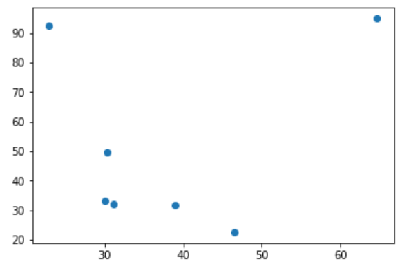
Let’s start by plotting all 7 event locations as dots on a scatter chart:
#Plot the X & Y location with dots
plt.plot(player50471.x,player50471.y, 'o')
Next up, we’re going to add lines around the most extreme parts of the plot. These most extreme parts are stored in a part of the hull object called simplices. We can just use a for loop to iterate through the simplices and draw lines between them:
#Plot the X & Y location with dots
plt.plot(player50471.x,player50471.y, 'o')

#Loop through each of the hull's simplices
for simplex in hull.simplices:
    #Draw a black line between each
    plt.plot(defpoints[simplex, 0], defpoints[simplex, 1], 'k-')
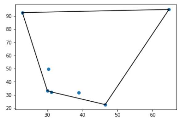
Looks kind of abstract, but a lot more interesting than the hull object on its own!
Let’s just add in some shading to make our area even clearer. We’ll also make it 30% transparent with the alpha argument:
#Plot the X & Y location with dots
plt.plot(player50471.x,player50471.y, 'o')

#Loop through each of the hull's simplices
for simplex in hull.simplices:
    #Draw a black line between each
    plt.plot(defpoints[simplex, 0], defpoints[simplex, 1], 'k-')

#Fill the area within the lines that we have drawn
plt.fill(defpoints[hull.vertices,0], defpoints[hull.vertices,1], 'k', alpha=0.3)
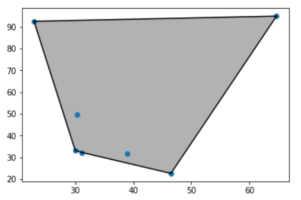
Perfect, we have one player’s zone of defensive actions plotted. We don’t have a pitch or any other players on there yet, but this is great work!
Let’s work on a bigger project now – let’s do all of this over and over for a whole team. We’ll take a single team out of our dataset, then use for loops to create the plot for each player (exactly as above) before plotting them together.
First up, let’s extract Team B into one dataframe:
TeamB = defdata.loc[(defdata.team == "Team B")]
TeamB.head()
Perfect, just as before, but with different players on a single team.
We’ll now need to go through each player and do exactly what we did to plot just a single player. First up, we need to find out who we are dealing with. We can use .unique() to pool each individual into the variable ‘players’:
players = TeamB["player"].unique()
players
Every player now just needs to go into a for loop, where we’ll do exactly what we did before to get a plot. We’ll create a temporary dataframe for each player, create a hull from the x/y coordinates, then plot the lines and fill in the shape with a transparent colour. Let’s take a look with the help of some comments:
#For each player in our players variable
for player in players:

    #Create a new dataframe for the player
    df = TeamB[(TeamB.player == player)]

    #Create an array of the x/y coordinate groups
    points = df[['x', 'y']].values

    #If there are enough points for a hull, create it. If there's an error, forget about it
    try:
        hull = ConvexHull(df[['x','y']])

    except:
        pass

    #If we created the hull, draw the lines and fill with 5% transparent red. If there's an error, forget about it
    try:
        for simplex in hull.simplices:
            plt.plot(points[simplex, 0], points[simplex, 1], 'k-')
            plt.fill(points[hull.vertices,0], points[hull.vertices,1], 'red', alpha=0.05)

    except:
        pass

#Once all of the individual hulls have been created, plot them together
plt.show()
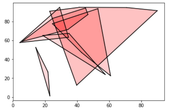
Fantastic work! We now have all of the players with enough data points on the chart. The transparency is a nice touch, as we can see any hidden players and where any crossover happens.
Our plot leaves out any players with less than 2 defensive actions in the data, so you may want to plot these as lines or dots. If so, you should be able to figure out how to do this from the code already, or from our other visualisation tutorials.
As for next steps, you might want to plot this on a pitch (pitch drawing tutorial here):
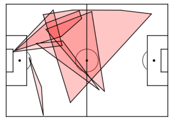
So now we can see where our team are performing their defensive actions – although remember a few players are missing. In terms of analysis, does this suggest that this team defends better on the left? Or is it more likely that they faced a team that largely attacked on that side? Visualisation is just one small piece of any analysis!
Summary
In this tutorial, we have practiced filtering a dataframe by player or team, then using SciPy’s convex hull tool to create the data for plotting the smallest area that contains our datapoints.
Some nice extensions to this that you may want to play with include adding some annotations for player names, or changing colours for each player. Of course, these charts aren’t limited to defensive metrics – why not take a look at penalty area entry pass zones, or compare goalkeeper distributions? However you build on this work, show us what you’re achieving on Twitter @FC_Python!
Find further visualisation tutorials here!