

More often than not, a chart isn’t enough by itself. You need context, annotations, aggregations and explanations to make sure that your conclusion is heard.
Subplots, or multiple charts on the same plot, can go a long way to add your aggregations and explanations visually, doing lots of the heavy lifting to clarify the point you are getting across.
Want to show a player’s busiest third of the pitch? Aggregate touches in a chart alongside the pitch.
Want to compare every team’s xG per game? Plot every team in a grid of charts.
In this tutorial, we will take a look at how we can create subplots manually, programatically and give some examples of their applications. First up, let’s load in our modules, with a very grateful nod to @numberstorm’s mplsoccer.
import matplotlib.pyplot as plt
import numpy as np
import pandas as pd
import random
from mplsoccer.pitch import Pitch
Manually adding plots together
The easiest way to create multiple plots is to manually add them to a figure. We create a blank figure, then use the .add_axes() argument to add a new chart – passing the dimensions (left, bottom, width, height) in the arguments.
The .add_axes() call is assigned to a variable, with which we can then create our charts or add text:
fig = plt.figure()
ax1 = fig.add_axes([0.1, 0.5, 1, 0.4],
                    xticklabels=[], ylim=(0, 100))
ax2 = fig.add_axes([0.1, 0.1, 1, 0.4],
                    ylim=(0, 100))
ax1.text(0.5,50,"Top Plot!")
ax2.text(0.5,50,"Bottom Plot!")
plt.show()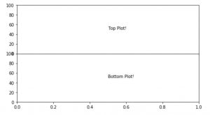
Instead of text, why don’t you give it a try with a scatter or histogram?
This is great and super customisable, but you need a loop or some very manual work to add lots of them in a tidy and orderly fashion. Surely there is a better way…
Creating a grid and navigating it
This time, we will make use of the .subplots() function to create neat rows and columns of plots. .subplots() takes a few arguments; you have to tell it the number of rows and columns, but you can also use the sharex & sharey arguments to make sure that the whole grid uses the same axes scale. You’ll see that this gets rid of axes labels on the inside of the grid and looks loads better. The underlying theory point of ‘less is more’ helps us a lot here!
Let’s plot a 2 row, 3 column plot… in just 1 line!
fig, ax = plt.subplots(2, 3, sharex='col', sharey='row', figsize = (6,3), dpi = 140)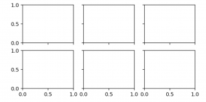
Each of the 6 plots can easily be called for with square brackets and coordinates:
fig, ax = plt.subplots(2, 3, sharex='col', sharey='row', figsize = (6,3), dpi = 140)
ax[0, 0].text(0.5, 0.5, "I am plot 0,0…", ha='center'),
ax[0, 1].text(0.5, 0.5, "…I am plot 0,1…", ha='center'),
ax[1, 2].text(0.5, 0.5, "…and I am plot 1,2", ha='center'),
plt.show()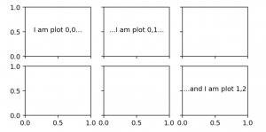
Or if you just want to use one row:
#Create random data in a dataframe with two columns - X/Y
df = pd.DataFrame(np.random.randint(0,100,size=(200, 2)), columns=['X', 'Y'])
fig, ax = plt.subplots(1, 2, sharex='col', sharey='row')
ax[0].plot(df['X'], df['Y'], 'o')
ax[1].hist(df['Y'], orientation='horizontal')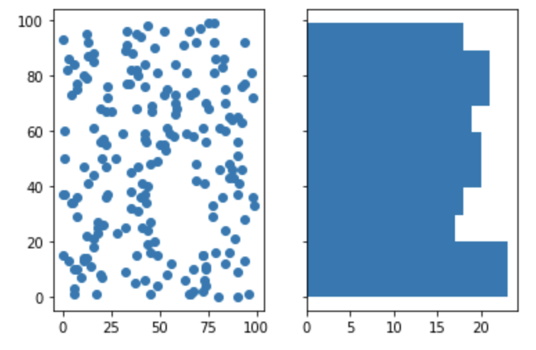
Let’s level this up with a for loop, and split out a bigger dataset for each plot, based on a variable.
Our dataset has six teams, and their xG values (random numbers). We create our figure and blank subplots as before, but this time we use enumerate and reshape to loop through the axes and plot a team in each. Let’s take a quick look at these two functions as they may be new to you.
enumerate: just like a for loop, but it gives us access to the number of the specific for loop. This is useful is we want to use it to select an item from another list that is not being used for the loop. In this example, we loop through the charts but want access to the teams and colours – enumerate lets us do this.
reshape: Our axes are a 2×3 grid of charts. Reshape allows us to mould that 2×3 grid into a 1×6 list with which we can reference each chart simply.
With those in mind, you should be able to work through this code and see how we end up with the chart below
#Create our colour list for the chart
colors = ['red', 'skyblue', 'navy', 'pink', 'green', 'black']

#Create our dataframe
teams = ['United', 'City', 'Albion', 'Athletic', 'FC', 'County']
xGFor = np.random.rand(200)*3
teamsArray = np.random.choice(teams, 200)
df = pd.DataFrame({'Team':teamsArray,'xGFor':xGFor, 'xGAgainst':xGAgainst})

#Blank subplots
fig, ax = plt.subplots(2, 3, sharex='col', sharey='row', figsize = (6,3), dpi = 140)

#Loop through each chart in the subplot
for count, item in enumerate(ax.reshape(-1)):

     #Histogram for each team
     item.hist(df[df['Team']==teams[count]]['xGFor'],10, color = colors[count],range=[0, 3])

     #Add team name
     item.text(0.1,0.8,teams[count],transform=item.transAxes)

     #Adjust axes limits
     item.set_ylim([0,10])
     item.set_xlim([0,3])

     Figure axes titles
     fig.text(0.5, -0.02, 'xGFor', ha='center', va='center')
     fig.text(0.06, 0.5, 'Frequency', ha='center', va='center', rotation='vertical')

plt.show()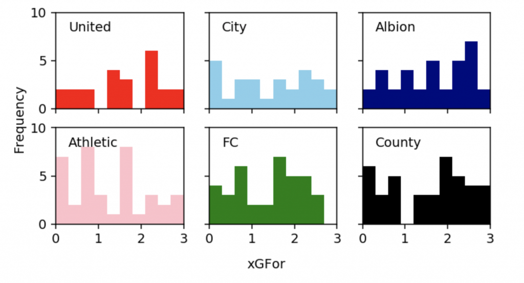
These plots can be really useful for exploratory analysis and communication. If you plan on using them often, check out Seaborn’s facet grid that makes them really easy to plot.
What if we want to up our customisation and create uneven layouts?
Creating an uneven grid
So far, we have just created plots and figures where we use them entirely for our visualisations. This time, we will create grids and use parts of them selectively to build plots of different sizes.
To do this, we can place a plt.GridSpec() on our plot. We pass a grid size to the argument, and can also set margins between the cells.
Within the grid, we then place plots on the coordinates where we want to. Do this with fig.add_subplots(), passing it the coordinates with grid[x,y].
Let’s create some random x/y data and create a scatterplot and histograms to summarise it. Notice the sharex and sharey arguments that align the data in the pitch and charts.
df = pd.DataFrame(np.random.randint(0,100,size=(200, 2)), columns=['X', 'Y'])
fig = plt.figure(figsize=(5,5), dpi = 140)
grid = plt.GridSpec(6, 6)

a1 = fig.add_subplot(grid[0:5, 0:5])
a2 = fig.add_subplot(grid[5, 1:4],sharex=a1)
a3 = fig.add_subplot(grid[0:5, 5],sharey=a1)

pitch = Pitch(pitch_type='opta', orientation='vertical', stripe=False)
pitch.draw(ax=a1)
pitch.scatter(df['X'], df['Y'],
                    s=10, c='black', label='scatter', ax=a1)

a2.hist(df['Y'], 3, color = 'black', histtype='stepfilled')
a3.hist(df['X'], 9, orientation='horizontal', color='black', histtype='stepfilled')

plt.show()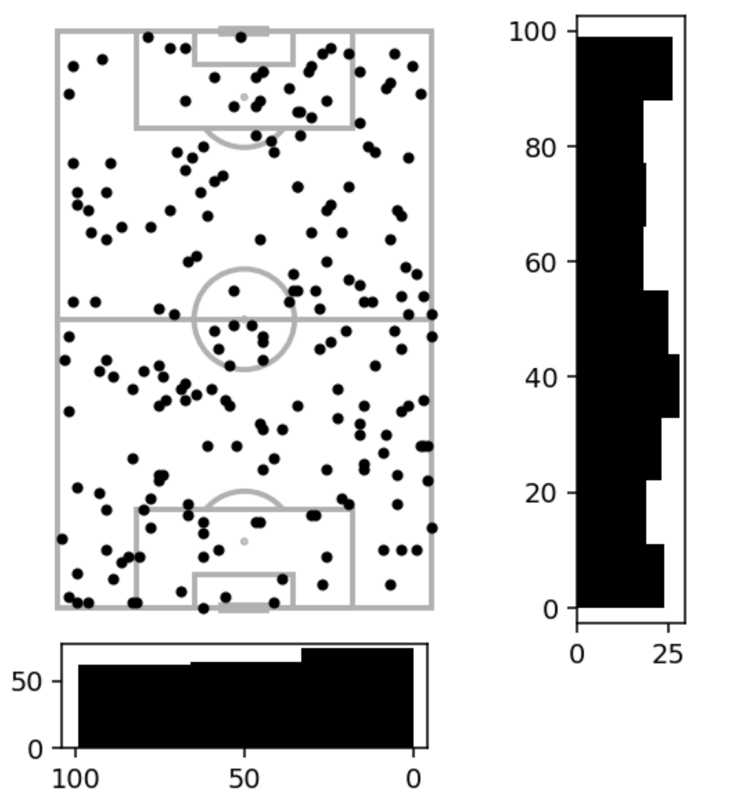
Now let’s level this up with some styling, removing axes, and more:
df = pd.DataFrame(np.random.randint(0,100,size=(200, 2)), columns=['X', 'Y'])
fig = plt.figure(figsize=(5,5), dpi = 140)
grid = plt.GridSpec(6, 6, wspace=-0.45, hspace=0.2)

a1 = fig.add_subplot(grid[0:5, 0:5])
a2 = fig.add_subplot(grid[5, 1:4],sharex=a1)
a3 = fig.add_subplot(grid[0:5, 5],sharey=a1)

pitch = Pitch(pitch_type='opta', orientation='vertical', pitch_color='#f7fafa', line_color='pink', stripe=False)
pitch.draw(ax=a1)
pitch.scatter(df['X'], df['Y'],
                    s=10, c='#06c7c4', label='scatter', ax=a1)

a2.hist(df['Y'], 3, color = 'pink', edgecolor="#fc8197", histtype='stepfilled')
a2.axis('off')

a3.hist(df['X'], 9, orientation='horizontal', color='pink', edgecolor="#fc8197", histtype='stepfilled')
a3.axis('off')

plt.text(-64.8,110,'Player X - Touches', size=14)
fig.set_facecolor('#ffffff')

plt.show()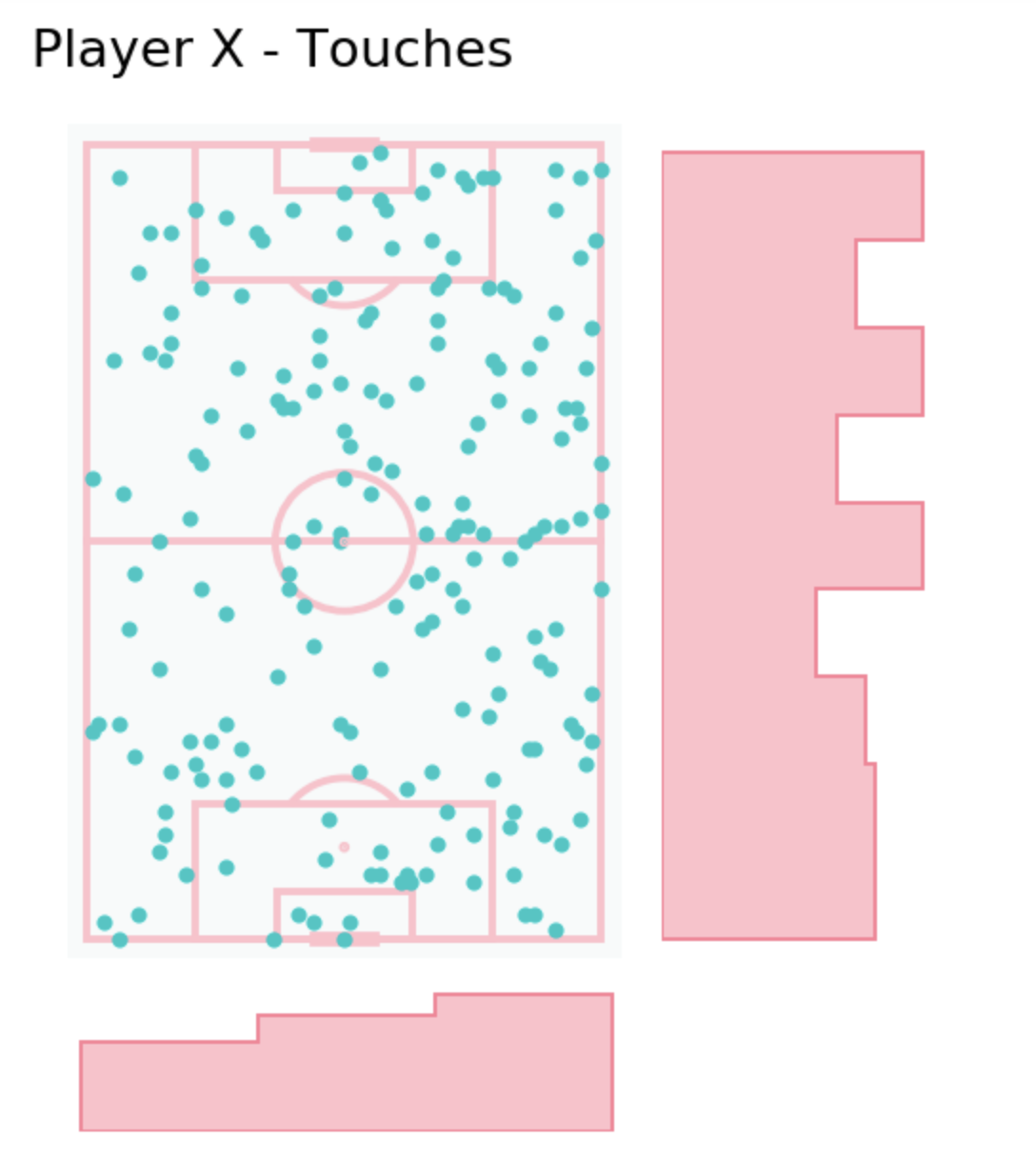
@danzn1 got in touch with a great alternative to subplot that you may find more intuitive, using subplot_mosaic:
Conclusion
In this tutorial we have seen a number of ways to create multiple plots on the same figure.
We can do this manually, if we know explicitly what we want to plot and where.
We also have the option to create grids and access them programatically, to quickly plot subsets of our data.
Finally, we created uneven plots to give both a summary and specifics of x/y pitch data in one figure.
We’d love to see what you create with subplots, get in touch on Twitter and let us know!