

Streamlit is a Python library that makes creating and sharing analysis tools far easier than it should be. Think of it like a Jupyter notebook that only shows the parts you would want a non-programmer end user to interact with – data, visualisations, filters – without the code.
This article will introduce you to Streamlit. We’ll take you through getting the package and your app set up, importing data into it, calculating new columns and finally creating the visuals and filters that make it into something interactive.
Our project will use data from the 20/21 season of the Premier League’s Fantasy Football competition to build a basic app to filter and visualise player data.
The data and code for this tutorial are available here.
As general recommendations, I think that this is best learned with Anaconda to manage your environment, and VS Code to have your code and terminal running in the same place.
Getting off the ground with Streamlit
The very first thing that we need to do is install Streamlit, which we do as we would any other package. Head over to the terminal in your Python environment and install Streamlit with either Conda or Pip.
conda install streamlit
Or if you are not using Anaconda
pip install streamlit
With it installed, let’s now create a new folder for our app. In this folder, create a new file called fpl-app.py (or whatever you want – just remember to use your new name later in the tutorial). Also in this folder, download the csv here and place it alongside your new .py file.
Before we get started properly, we need to get our blank app up and running. Open up Python environment terminal (easiest to do this in VS code by opening the command palette and selecting ‘create new integrated terminal), make sure you are in the new folder and run ‘streamlit run fpl-app.py’. This will open up our blank app, which we are going to make a lot more useful in the coming steps.
Importing our data and enhancing it
As with any Python code, we need to import our packages. Open up your blank fpl-app.py file and import the three modules we’ll use in this tutorial:
import pandas as pd
import numpy as np
import streamlit as st
With pandas installed, we can now import our data easily. Use read_csv to load in the data that you downloaded earlier and placed in the same folder:
df = pd.read_csv('fpldata.csv')This data frame is from FPL 20/21. Each row is a player, and contains their data on points, cost, team, minutes played and a few basic performance metrics.
Regardless of the project, we are hostage to the strength of our data. So let’s improve what we have here before we create anything else.
We have minutes played and we will use this metric to add context to the other performance metrics – goals, assists & points. Firstly, we will create a ’90 minutes played’ metric, then use this to create p90 stats of these three metrics:
df[‘90s’] = df[‘minutes’]/90
calc_elements = [‘goals’, ‘assists’, ‘points’]
for each in calc_elements:
    df[f’{each}_p90’] = df[each] / df[‘90s’]
This will give us a lot more insight when it comes to our dashboard.
Finally, to help us to create filters for teams and positions, we need to get lists of the unique values in each. Rather than do this manually, we can do this by simply creating a list of these columns, then dropping the duplicates:
positions = list(df[‘position’].drop_duplicates())
teams = list(df[‘team’].drop_duplicates())
And this is all we have to do to get our data together! We’re now ready to get started on our app. The first thing we will do is create our filters in the sidebar of the app, which will be applied to our dataframe. The app will then use this filtered dataframe to present data and visualisations in the main part of the app.
Adding Filters
Before displaying the data, we need to add filters that will allow the user to select just what is relevant to them.
We add filters and other components to the app with the Streamlit library. As just two examples, adding a dataframe is done with st.dataframe() (we imported streamlit as st) and adding a slider is st.slider().
We are going to add our filters in the sidebar of the app, which we do by calling sidebar before our component. So st.slider() would be placed in the sidebar with st.sidebar.slider() – easy!
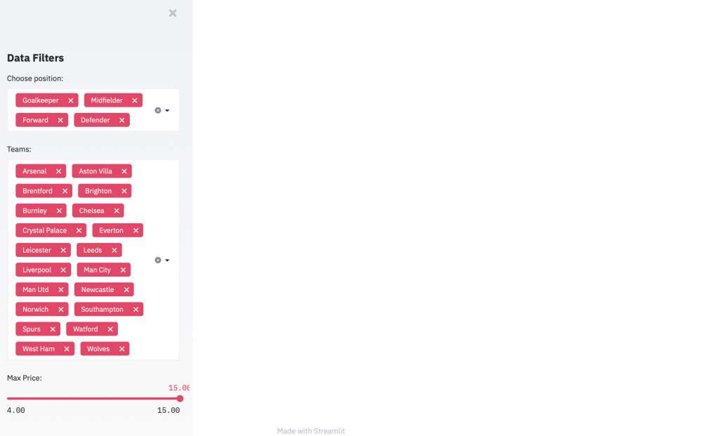
Let’s first create a filter that allows us to pick which position we want to filter players by. A handy tool for this is multiselect, allowing us to pick one or many options.
We add this to our app by assigning it to a variable, which will store our selection. Within the st.sidebar.multiselect() function, we pass the text label, the possible options and the default. Remember, we saved our positions in the ‘positions’ variable earlier, so our code looks like this:
position_choice = st.sidebar.multiselect(
    'Choose position:', positions, default=positions)
And let’s add another multiselect for teams:
teams_choice = st.sidebar.multiselect(
    "Teams:", teams, default=teams)
Filtering by value would also be useful, but multiselect would be impractical. Instead a slider might be better. The st.slider() function needs a label, minimum value, maximum value, change step and default value. Something like this:
price_choice = st.sidebar.slider(
    'Max Price:', min_value=4, max_value=15.0, step=.5, value=15.0)
Refresh your app to take a look at your filters. It should look something like this, your filters across the left of the page.
There are many other types of filters available in Streamlit, including checkboxes, buttons and radio buttons. Check out your other options in the documentation.
Finally, we need to actually use these filters to slim down our dataframe to give the app the correct data to display to the user. You could do this all in one line, but for the sake of simplicity in this tutorial, let’s do them one by one:
df = df[df['position'].isin(position_choice)]
df = df[df['team'].isin(teams_choice)]
df = df[df['cost'] < price_choice]
The df variable will now be filtered by whatever the user picks! Our next job is to display it.
Creating Visuals
As there are many types of filters, there are plenty of ways to display the information. We’ll build a table and an interactive chart, but you’ll find the wealth of other options in the docs.
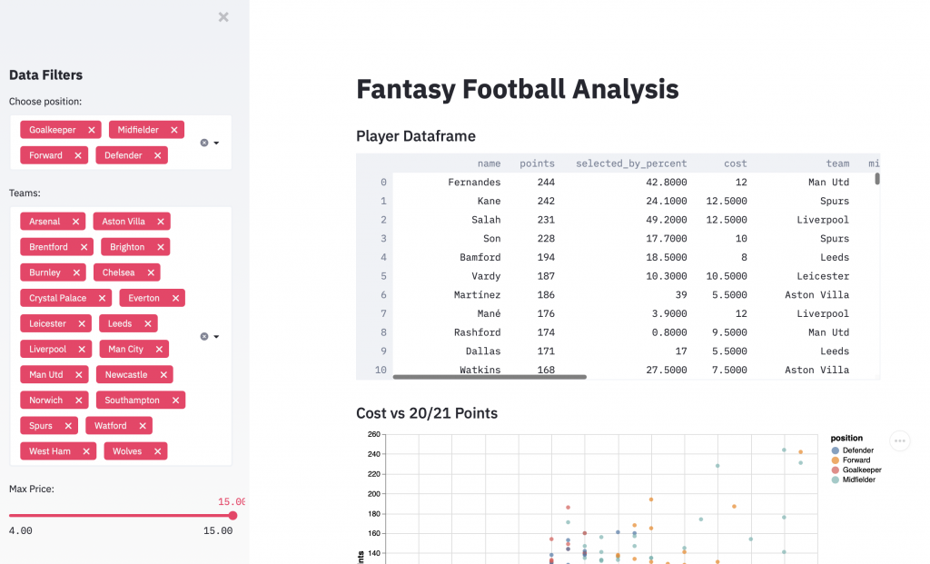
Every page needs a title and st.title() gives us just that:
st.title(f"Fantasy Football Analysis")If you want to add normal body text, you can simply use st.write(). However, I prefer st.markdown() as it gives you more freedom to format. Markdown gives syntax that formats text for you, and this cheat sheet runs through your options.
To create a subheading with st.markdown(), we use the following code:
st.markdown(‘### Player Dataframe’)Under which, we obviously need to add a dataframe, which Streamlit again makes so simple:
st.dataframe(df.sort_values('points',
             ascending=False).reset_index(drop=True))
We could simply pass the df variable, but I think it is more useful for the user to give it a relevant order. So we have sorted it by points when we pass it. Streamlit and pandas sort the table for us, before posting it in the app.
Now for something visual. Streamlit allows us to display plots and images from loads of different sources. Local images, Matplotlib plots, the Plotly library and more (check the docs). In this example, we’ll use a really nice library called vega-lite. Vega-lite is a javascript library, but streamlit will do the hard work for us to convert our streamlit function into everything we need.
Let’s take a look with an example for cost vs points, with some extra information shown by colour and in the tooltips:
This is our header
 st.markdown('### Cost vs 20/21 Points')
 This is our plot
 st.vega_lite_chart(df, {
     'mark': {'type': 'circle', 'tooltip': True},
     'encoding': {
         'x': {'field': 'cost', 'type': 'quantitative'},
         'y': {'field': 'points', 'type': 'quantitative'},
         'color': {'field': 'position', 'type': 'nominal'},
         'tooltip': [{"field": 'name', 'type': 'nominal'}, {'field': 'cost', 'type': 'quantitative'}, {'field': 'points', 'type': 'quantitative'}],
     },
     'width': 700,
     'height': 400,
})- Mark – what mark are we using to signify the data points?
- Encoding:
- X – What is the x axis?
- Y – What is the y axis?
- Colour – What does colour show?
- Tooltip – Which data points would you like in the tooltips?
- Width/height – What size should the chart be?
st.vega_lite_chart(df, {
     'mark': {'type': 'circle', 'tooltip': True},
     'encoding': {
         'x': {'field': 'goals_p90', 'type': 'quantitative'},
         'y': {'field': 'assists_p90', 'type': 'quantitative'},
         'color': {'field': 'position', 'type': 'nominal'},
         'tooltip': [{"field": 'name', 'type': 'nominal'}, {'field': 'cost', 'type': 'quantitative'}, {'field': 'points', 'type': 'quantitative'}],
     },
     'width': 700,
     'height': 400,
 })
And now we have our app! Filters on the left should filter the data in the main part, with a refresh taking you back to a new start in case you run into any issues.
Next Steps
This barely scratches the surface of what is possible with Streamlit, but I hope it gives you a nice introduction to importing data, running some calculations, then making it accessible to users to play around with.
To develop these concepts further, you may want to look at extra chart or filter types, or connecting to an updating data source on a website/API, or running machine learning models for users to interact with. The limit really is your imagination, as you can do whatever you want to in the backend before showing the user only what you want to.
As always, we hope that you learned something here and enjoyed yourself along the way. Let us know any feedback @fc_python, and we’d love to see what you create with this tutorial!