

Scatter plots are the go-to for illustrating the relationship between two variables. They can show huge amounts of data, but often at a cost of being able to tell the identity of any given data point.
Key data points can be highlighted with annotations, but when we have a smaller dataset and value in distinguishing each point, we might want to add images instead of anonymous points.
In this tutorial, we’re going to create a scatter plot of teams xG & xGA, but with club logos representing each one.
To do this, we’re going to go through the following steps:
- Prep our badge images
- Import and check data
- Plot a regular scatter chart
- Plot badges on top of the scatter points
- Tidy and improve our chart
All the data and images needed to follow this tutorial are available here.
Setting up our images
To automate plotting each image, we need to have some order to our image locations and names.
The simplest way to do this is to keep them all in a folder alongside our code and have a naming convention of ‘team name’.png. The team names match up to the data that we are going to use soon. All of this is already prepared for you in the Github folder.
![]()
Import data
To start with, our data has three columns: team name, xG for and xG against. Let’s import our modules, data and check the first few lines of the dataframe:
import pandas as pd
import matplotlib.pyplot as plt
from matplotlib.offsetbox import OffsetImage, AnnotationBbox
df = pd.read_csv(‘xGTable.csv’)
df.head()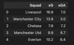
We have our numbers to plot, but we need to add a reference for each team’s badge location in a new column. As we took the time to match the badge file names against the team names, this is really simple – we just add ‘images/‘ before and ‘.png’ after the team name. Let’s save this in a new column called ‘path’:
df[‘path’] = df[‘Squad’] + ‘.png’
df.head()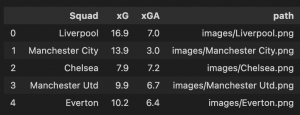
Plot a regular scatter chart
Before making our plot with the badges, we need to create a regular scatter plot. This gives us the correct dimensions of the plot, the axes and other benefits of working with a matplotlib figure in Python. Once we have this, we can get fancy with our badges and other cosmetic changes.
We have covered scatter plots before here, so let’s get straight into it.
fig, ax = plt.subplots(figsize=(6, 4), dpi=120)
ax.scatter(df[‘xG’], df[‘xGA’])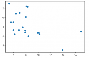
Super simple chart, and without annotations or visual cues we cannot tell who any of the points are. Adding badges will hopefully add more value and information to our plot.
Adding badges to our plot
Our base figure provides the canvas for the club badges. Adding these requires a couple of extra matplotlib tools.
The first one we will use is ‘OffsetImage’, which creates a box with an image, allows us to edit the image and readies it to be added to our plot. Let’s add this to a function as we’ll use it a few times:
def getImage(path):
    return OffsetImage(plt.imread(path), zoom=.05, alpha = 1)
OffsetImage takes a few arguments. Let’s look at them in order:
- The image. We use the plt.imread function to read in an image from the location that we provide. In this case, it will look in the path that we created in the dataframe earlier.
- Zoom level. The images are too big by default. .05 reduces their size to 5% of the original.
- Alpha level. Our badges are likely to overlap, in case you want to make them transparent, change this figure to any number between 0 and 1.
This function prepares the image, but we still need to plot them. Let’s do this by creating a new plot, just as before, then iterating on our dataframe to plot each team crest.
fig, ax = plt.subplots(figsize=(6, 4), dpi=120)
ax.scatter(df[‘xG’], df[‘xGA’], color=‘white’)

for index, row in df.iterrows():
    ab = AnnotationBbox(getImage(row[‘path’]), (row[‘xG’], row[‘xGA’]), frameon=False)
    ax.add_artist(ab)
What’s happening here? Firstly, we have created our scatter plot with white points to hide them against the background, rather than interfere with the club logos.
We then iterate through our dataframe with df.iterrows(). For each row of our data we create a new variable called ‘ab’ which uses the AnnotationBbox function from matplotlib to take the desired image and assign its x/y location. The ax.add_artist function then draws this on our plot.
This should give us something like this:
![]()
Great work! We can now see who all the points are!
Improving our chart
Clearly there is plenty to improve on this chart. I won’t go through everything individually, but I’ll share the commented code below for some of the essential changes – titles, colours, comments, etc.
# Set font and background colour
plt.rcParams.update({'font.family':'Avenir'})
bgcol = '#fafafa'
# Create initial plot
fig, ax = plt.subplots(figsize=(6, 4), dpi=120)
fig.set_facecolor(bgcol)
ax.set_facecolor(bgcol)
ax.scatter(df['xG'], df['xGA'], c=bgcol)
# Change plot spines
ax.spines['right'].set_visible(False)
ax.spines['top'].set_visible(False)
ax.spines['left'].set_color('#ccc8c8')
ax.spines['bottom'].set_color('#ccc8c8')
# Change ticks
plt.tick_params(axis='x', labelsize=12, color='#ccc8c8')
plt.tick_params(axis='y', labelsize=12, color='#ccc8c8')
# Plot badges
def getImage(path):
return OffsetImage(plt.imread(path), zoom=.05, alpha = 1)
for index, row in df.iterrows():
ab = AnnotationBbox(getImage(row['path']), (row['xG'], row['xGA']), frameon=False)
ax.add_artist(ab)
# Add average lines
plt.hlines(df['xGA'].mean(), df['xG'].min(), df['xG'].max(), color='#c2c1c0')
plt.vlines(df['xG'].mean(), df['xGA'].min(), df['xGA'].max(), color='#c2c1c0')
# Text
## Title & comment
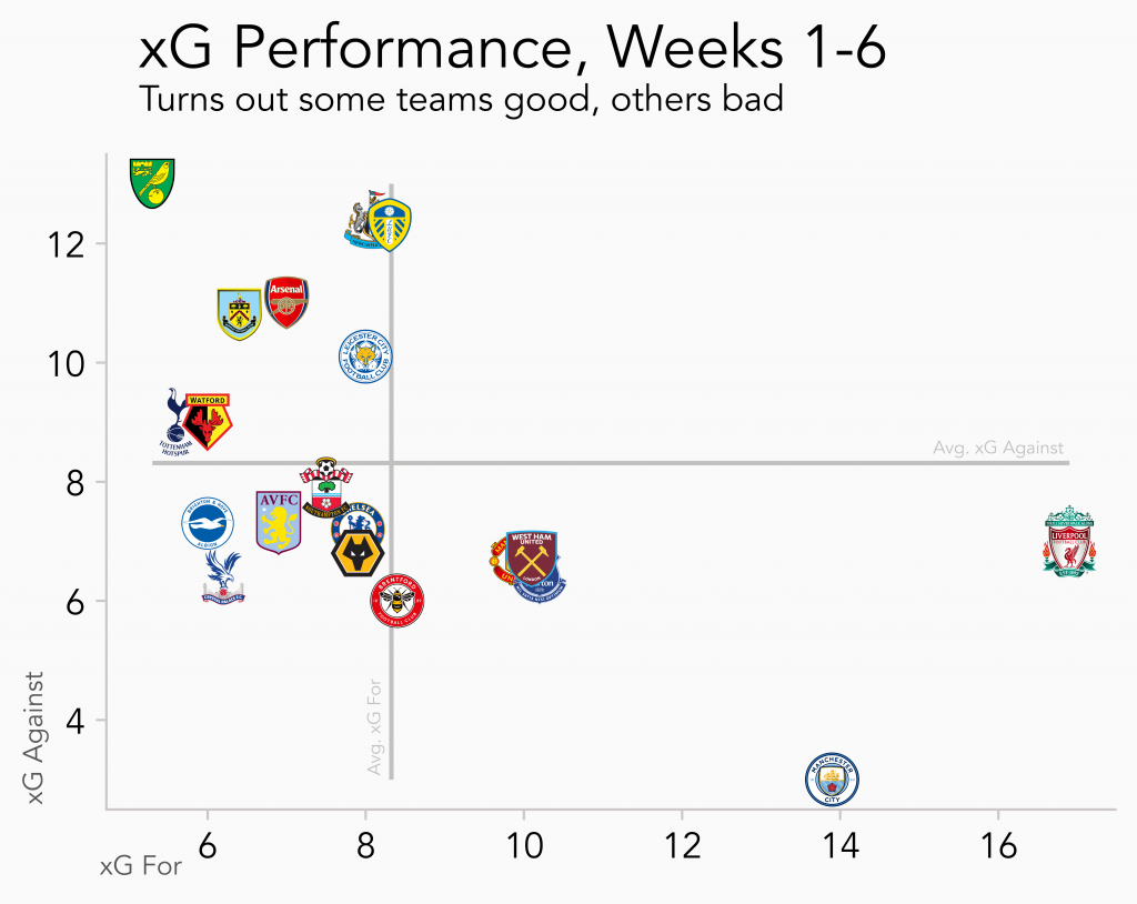
fig.text(.15,.98,'xG Performance, Weeks 1-6',size=20)
fig.text(.15,.93,'Turns out some teams good, others bad', size=12)
## Avg line explanation
fig.text(.06,.14,'xG Against', size=9, color='#575654',rotation=90)
fig.text(.12,0.05,'xG For', size=9, color='#575654')
## Axes titles
fig.text(.76,.535,'Avg. xG Against', size=6, color='#c2c1c0')
fig.text(.325,.17,'Avg. xG For', size=6, color='#c2c1c0',rotation=90)
## Save plot
plt.savefig('xGChart.png', dpi=1200, bbox_inches = "tight")This should return something like this:
Conclusion
In this tutorial we have learned how to programmatically add images to a scatter plot. We created an underlying plot, then looped through the data to overlay a relevant image on each point.
This isn’t a good idea for every scatter chart, particularly when there are many points, as it will be an absolute mess. But with limited data points and value in distinguishing between them, I think we have a good use case for using club logos in our example.
You might also have luck using this method to distinguish between leagues, or drawing the image for just a few data points that you want to highlight in place of an annotation.
Interested in other visualisations with Python? Check out our other tutorials here!